
When you build a web page, it really helps to think in rows and columns. Rows let you stack content from top to bottom, and columns help you place things side by side — like text next to an image. This structure keeps your page tidy and easy to read. The best part? It also makes your layout automatically adjust to different screen sizes, so your website looks great on phones, tablets, and computers.
Work with sections 🆓
Sections help you with the structure

Click on “Block Inserter” (the blue + at the top left). A window will open on the left side.
Scroll down until you see the section titled “Design”.
Drag and drop the element where you want it on your page – or simply click the element to insert it.
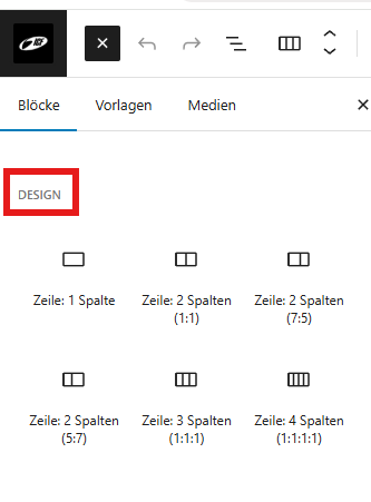
Choose how many rows/columns you want to design the next section. In the example we choose a row with four columns:

In the next step, by pressing the + we insert the desired block (text, slider, graphic, etc.).

picture | picture | List | Btuttom |
In the article inner/outer spacing we will center the button and change the spacing between the columns.
Inner/outer spacing ↔️
Why use padding and margins in rows and columns?

